Charting data


One of the most important considerations when you chart data is the way that you supply the data to the cfchart tag. You can supply data in the following ways:

  • Specify individual data points by using cfchartdata tags.

  • Provide all the data in a single query by using cfchartseries tags.

  • Combine data from a query with additional data points from cfchartdata tags.

  • Provide all the data in a report created with Report Builder. For more information, see Creating Reports and Documents for Printing.

Note: The cfchart tag charts numeric data only. As a result, convert any dates, times, or preformatted currency values, such as $3,000.53, to integers or real numbers.

Charting individual data points

When you chart individual data points, you specify each data point by inserting a cfchartdata tag in the cfchartseries tag body. For example, the following code creates a simple pie chart:

<cfchart> 
    <cfchartseries type="pie"> 
        <cfchartdata item="New Vehicle Sales" value=500000> 
        <cfchartdata item="Used Vehicle Sales" value=250000> 
        <cfchartdata item="Leasing" value=300000> 
        <cfchartdata item="Service" value=400000> 
    </cfchartseries> 
</cfchart>

This pie chart displays four types of revenue for a car dealer. Each cfchartdata tag specifies the income for a department and a description for the legend.

Note: If two data points have the same item name, ColdFusion creates a graph of the value for the last one specified within the cfchart tag.

The cfchartdata tag lets you specify the following information about a data point:

Attribute

Description

value

The data value to chart. This attribute is required.

item

(Optional) The description for this data point. The item appears on the horizontal axis of bar and line charts, on the vertical axis of horizontal bar charts, and in the legend of pie charts.

Charting a query

Each bar, dot, line, or slice of a chart represents data from one row/column coordinate in your result set. A related group of data is called a chart series.

Because each bar, dot, line, or slice represents the intersection of two axes, craft the query result set such that the row and column values have meaning when displayed in a chart. Often, doing so requires you aggregate data in the query. You typically aggregate data in a query using one of the following:

  • Specify a SQL aggregate function (SUM, AVG, MAX, and so on) using a GROUP BY clause in the SELECT statement.

  • Use a Query of Queries.

  • Retrieve data from a view, instead of a table.

When you chart a query, you specify the query name using the query attribute of the cfchartseries tag. For example, the code for a simple bar chart could be as follows:

<cfchart 
        xAxisTitle="Department" 
        yAxisTitle="Salary Average" 
    > 
    <cfchartseries  
        type="bar"  
        query="DataTable"  
        valueColumn="AvgByDept"  
        itemColumn="Dept_Name" 
        /> 
</cfchart>

This example displays the values in the AvgByDept column of the DataTable query. It displays the Dept_Name column value as the item label by each bar.

The following table lists the attributes of the cfchartseries tag that you use when working with queries:

Attribute

Description

query

The query that contains the data. Also specify the valueColumn and itemColumn.

valueColumn

The query column that contains the values to chart.

itemColumn

The query column that contains the description for this data point. The item normally appears on the horizontal axis of bar and line charts, on the vertical axis of horizontalbar charts, and in the legend in pie charts.

Charting a query of queries

In addition to charting the results of a query, you can also chart the results of a query of queries. For more information about using query of queries, see Using Query of Queries. Query of queries provides significant power in generating the data for the chart. For example, you can use aggregating functions such as SUM, AVG, and GROUP BY to create a query of queries with statistical data based on a raw database query. For more information, see Using Query of Queries.

You can also take advantage of the ability to dynamically reference and modify query data. For example, you can loop through the entries in a query column and reformat the data to show whole dollar values.

The example in the following procedure analyzes the salary data in the cfdocexamples database using a query of queries, and displays the data as a bar chart.

  1. Create a ColdFusion page with the following content:

    <!--- Get the raw data from the database. ---> 
    <cfquery name="GetSalaries" datasource="cfdocexamples"> 
        SELECT Departmt.Dept_Name,  
            Employee.Salary 
        FROM Departmt, Employee 
        WHERE Departmt.Dept_ID = Employee.Dept_ID 
    </cfquery> 
     
    <!--- Generate a query with statistical data for each department. ---> 
    <cfquery dbtype = "query" name = "DeptSalaries"> 
        SELECT  
            Dept_Name, 
            AVG(Salary) AS AvgByDept 
        FROM GetSalaries 
        GROUP BY Dept_Name 
    </cfquery> 
     
    <!--- Reformat the generated numbers to show only thousands. ---> 
    <cfloop index="i" from="1" to="#DeptSalaries.RecordCount#"> 
        <cfset DeptSalaries.AvgByDept[i]=Round(DeptSalaries.AvgByDept[i]/1000)*1000> 
    </cfloop> 
     
    <html> 
    <head> 
        <title>Employee Salary Analysis</title> 
    </head> 
     
    <body> 
    <h1>Employee Salary Analysis</h1>  
     
    <!--- Bar chart, from DeptSalaries Query of Queries. ---> 
    <cfchart  
            xAxisTitle="Department" 
            yAxisTitle="Salary Average" 
            font="Arial" 
            gridlines=6 
            showXGridlines="yes" 
            showYGridlines="yes" 
            showborder="yes" 
            show3d="yes"  
        >  
     
        <cfchartseries  
            type="bar"  
            query="DeptSalaries"  
            valueColumn="AvgByDept"  
            itemColumn="Dept_Name" 
            seriesColor="olive"  
            paintStyle="plain" 
        /> 
    </cfchart> 
     
    <br> 
    </body> 
    </html>
  2. Save the page as chartdata.cfm in the myapps directory under the web root directory. For example, the directory path in Windows could be C:\Inetpub\wwwroot\myapps.

  3. Return to your browser and enter the following URL to view the chartdata.cfm page:

    http://localhost/myapps/chartdata.cfm

Note: If a query contains two rows with the same value for the itemColumn attribute, ColdFusion graphs the last row in the query for that value. For the preceding example, if the query contains two rows for the Sales department, ColdFusion graphs the value for the last row in the query for Sales.

Reviewing the code

The following table describes the code and its function:

Code

Description

<cfquery name="GetSalaries" datasource="cfdocexamples"> 
    SELECT Departmt.Dept_Name, Employee.Salary 
    FROM Departmt, Employee 
    WHERE Departmt.Dept_ID = Employee.Dept_ID 
</cfquery> 

Query the cfdocexamples database to get the Dept_Name and Salary for each employee. Because the Dept_Name is in the Departmt table and the Salary is in the Employee table, you need a table join in the WHERE clause. You can use the raw results of this query elsewhere on the page.

<cfquery dbtype = "query" name = "DeptSalaries"> 
    SELECT  
        Dept_Name, 
        AVG(Salary) AS AvgByDept 
    FROM GetSalaries 
    GROUP BY Dept_Name 
</cfquery>

Generate a new query from the GetSalaries query. Use the AVG aggregating function to get statistical data on the employees. Use the GROUP BY statement to ensure that only one row exists for each department.

<cfloop index="i" from="1" to="#DeptSalaries.RecordCount#"> 
    <cfset DeptSalaries.AvgByDept[i]=Round(DeptSalaries.AvgByDept[i]/1000)*1000> 
</cfloop>

Loop through all the rows in the DeptSalaries query and round the salary data to the nearest thousand. This loop uses the RecordCount query variable to get the number of rows, and directly changes the contents of the query object.

<cfchart  
        xAxisTitle="Department" 
        yAxisTitle="Salary Average" 
        font="Arial" 
        gridlines=6 
        showXGridlines="yes" 
        showYGridlines="yes" 
        showborder="yes" 
        show3d="yes"  
    >  
 <cfchartseries  
        type="bar"  
        query="DeptSalaries"  
        valueColumn="AvgByDept"  
        itemColumn="Dept_Name" 
        seriesColor="olive"  
        paintStyle="plain" 
    /> 
</cfchart>

Create a bar chart using the data from the AvgByDept column of the DeptSalaries query. Label the bars with the department names.

You can also rewrite this example to use the cfoutput and cfchartdata tags within the cfchartseries tag, instead of using the loop, to round the salary data, as the following code shows:

<cfchartseries  
    type="bar"  
    seriesColor="olive"  
    paintStyle="plain"> 
 
    <cfoutput query="deptSalaries"> 
        <cfchartdata item="#dept_name#" value=#Round(AvgByDept/1000)*1000#> 
    </cfoutput> 
 
</cfchartseries>

Combining a query and data points

To chart data from both query and individual data values, you specify the query name and related attributes in the cfchartseries tag, and provide additional data points by using the cfchartdata tag.

ColdFusion displays the chart data specified by a cfchartdata tag before the data from a query, for example, to the left on a bar chart. You can use the sortXAxis attribute of the cfchart tag to sort data alphabetically along the x axis.

One use of combining queries and data points is to provide data that is missing from the database; for example, to provide the data for one department if the data for that department is missing. The example in the following procedure adds data for the Facilities and Documentation departments to the salary data obtained from the query shown in the previous section:
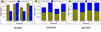
  1. Open the chartdata.cfm file in your editor.

  2. Edit the cfchart tag so that it appears as follows:

    <cfchart chartwidth="600"> 
        <cfchartseries  
            type="bar" 
            query="DeptSalaries" 
            itemColumn ="Dept_Name"  
            valueColumn="AvgByDept" 
            > 
            <cfchartdata item="Facilities" value="35000"> 
            <cfchartdata item="Documentation" value="45000"> 
        </cfchartseries> 
    </cfchart>
  3. Save the page as chartqueryanddata.cfm in the myapps directory under the web root directory. For example, the directory path in Windows could be C:\Inetpub\wwwroot\myapps.

  4. Return to your browser and enter the following URL to view the chartqueryanddata.cfm page:

    http://localhost/myapps/chartqueryanddata.cfm

Charting multiple data collections

Sometimes, you could have more than one series of data to display on a single chart, or you want to compare two sets of data on the same chart. In some cases, you might want to use different charting types on the same chart. For example, you could include a line chart on a bar chart.

To combine multiple data series into a single chart, insert multiple cfchartseries tags within a single cfchart tag. You control how the multiple data collections are charted using the seriesPlacement attribute of the cfchart tag. Using this attribute, you can specify the following options:

default
Let ColdFusion determine the best method for combining the data.

cluster
Place corresponding chart elements from each series next to each other.

stacked
Combine the corresponding elements of each series.

percent
Show the elements of each series as a percentage of the total of all corresponding elements.

The following image shows these options for combining two bar charts:

You can also combine chart types. The following is a combination bar and line chart:

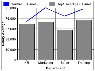
The only chart type that you cannot mix with others is the pie chart. If you define one of the data series to use a pie chart, no other chart appears.

The example in the following procedure creates the chart in the previous figure, which shows a bar chart with a line chart added to it. In this example, you chart the salary of permanent employees (bar) against contract employees (line).

Note: The layering of multiple series depends on the order that you specify the cfchartseries tags. For example, if you specify a bar chart first and a line chart second, the bar chart appears in front of the line chart in the final chart.

Create a combination bar chart and line chart

  1. Open the chartdata.cfm file in your editor.

  2. Edit the cfchart tag so that it appears as follows:

    <cfchart  
            backgroundColor="white" 
            xAxisTitle="Department" 
            yAxisTitle="Salary Average" 
            font="Arial" 
            gridlines=6 
            showXGridlines="yes" 
            showYGridlines="yes" 
            showborder="yes" 
        >  
        <cfchartseries  
            type="line"  
            seriesColor="blue"  
            paintStyle="plain" 
            seriesLabel="Contract Salaries" 
            > 
                <cfchartdata item="HR" value=70000> 
                <cfchartdata item="Marketing" value=95000> 
                <cfchartdata item="Sales" value=80000> 
                <cfchartdata item="Training" value=93000> 
            </cfchartseries> 
        <cfchartseries  
            type="bar"  
            query="DeptSalaries"  
            valueColumn="AvgByDept"  
            itemColumn="Dept_Name" 
            seriesColor="gray"  
            paintStyle="plain" 
            seriesLabel="Dept. Average Salaries" 
            /> 
     
    </cfchart>
  3. Save the file as chart2queries.cfm in the myapps directory under the web root directory.

  4. Return to your browser and view the chart2queries.cfm page.